’Jacks Axe New Logo With Fervor

 I have followed with great interest the dustup over the attempt to change Stephen F. Austin State University’s logo. I spent nearly 20 years total in Nacogdoches, first as a student, then running the newspaper a little more than a decade after graduating. I know many of the folks involved at the university in making the decision that sent thousands of alumni, students and other ’Jack backers to their keyboards to register their protests online. I taught journalism part-time at night there for nine years while working at the paper. And I followed with great enthusiasm the Lumberjacks’ fine basketball season and run into March Madness, which ended in the second round of the NCAA playoffs. Way to go, ’Jacks.
This semester, for the first time, I teach an advertising course at Kilgore College in which, along with my students, we are learning about brands, logos and the risks entailed in changing them. So we talked at length the other day about what happened down in Nacogdoches, at that lovely campus and university I still hold dear.
To summarize: SFA was about to launch a $1.25 million marketing campaign across the state with billboards, ads in Texas Monthly, signage in malls, online advertising, spots on Pandora online radio and other venues. It is a clever campaign, stating that “Lumberjacks make great engineers.” Or chemists. Or geologists. Or any number of professions in which one can receive an education at the university and be ready to join the work world.
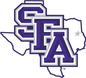
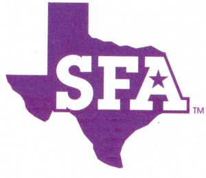
Part of the campaign included a new logo for the university. Both the old and new logos feature SFA and an outline version of the state of Texas. In the new version, pieces of Louisiana and possibly Arkansas were annexed to accommodate the “A” in SFA. This infuriated a goodly number of geographical purists, judging from the many comments on a petition page that quickly went up once a student leaked a cell phone photo of the new logo six days before it was about to be unveiled on March 31.
The controversy spread faster than pine pollen covers the landscape in early spring. An online petition set up on change.org quickly had more than 4,000 signers. The number stands at 8,450 as of midweek. It was clear that SFA students, alumni and boosters — at least those who cared enough to voice their opinion — hated the new logo.
To be honest, I was nonplussed by the whole brouhaha. Frankly, the old logo is not very attractive. I disliked it when I ran the paper because it did not reproduce well on cheap newsprint, which is admittedly a selfish reason, but there you go. I can’t say I was in love with the new logo, but it began to grow on me after seeing the ads in Texas Monthly, which arrived in my mailbox the day after the firestorm swept the campus. My copy of Sawdust, the alumni magazine, arrived as well. The cover featured the new logo. Ouch.
The university’s administration quickly regrouped. The petition was launched on March 26. By the next evening, SFA President Dr. Baker Patillo announced in a mass email that the new logo had been “suspended.” Since then, it has become clear that the new logo is not coming back. The billboards and future advertising and signage feature the old logo.
It is clear SFA officials made the right decision in pulling the new logo. Who could have anticipated such a reaction, especially from a student body that usually is fairly apathetic politically? When an issue riles up that many folks who care about the university, it certainly is a good idea to pay attention and act quickly.
As for my advertising students, none of whom plan to go to SFA (I made a pitch and said they should reconsider), they were fascinated by the controversy but also bemused. Most of them are graphic design majors, with a few photography and journalism majors, of the dozen-and-a-half in the class. The consensus appeared to favor the new logo over the old one, though some objected to the distortion of the state of Texas in the new logo. But none had any emotional ties to the university and were just looking at it from a design perspective.
So emotion does matter when it comes to branding, I told my students. You have to be careful about messing with traditions. I hope the rest of the marketing campaign goes smoothly for my alma mater. I will keep trying to send some students down that way once they leave KC.
Leave a reply
Fields marked with * are required


